- Jules Attard
- March 03rd, 2015
One of the situations I often encounter while coaching newly-trained Belts (and the more experienced ones too) is disillusion about the value of Control Charts to understand the behaviour of a process over time. The charts they produce have loads of Special Cause Variation; so much so that there is too much for them to react to, so the charts rapidly fall out of favour and the Belt abandons the attempt to study trends and unusual events in the data.
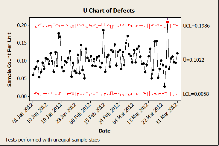
To remind you of the basics, Control Charts display variation in a process which can be broken down into two types: Common Cause and Special Cause Variation. Common Cause is the random variation that takes place in every process all the time; each measurement is different, but there is no pattern to the data and no unusual observations. Special Cause Variation, by contrast, is unusual: it displays a pattern, trend, or one or more unusual observations. A typical Control Chart would look like this; the red points indicate Special Cause Variation.
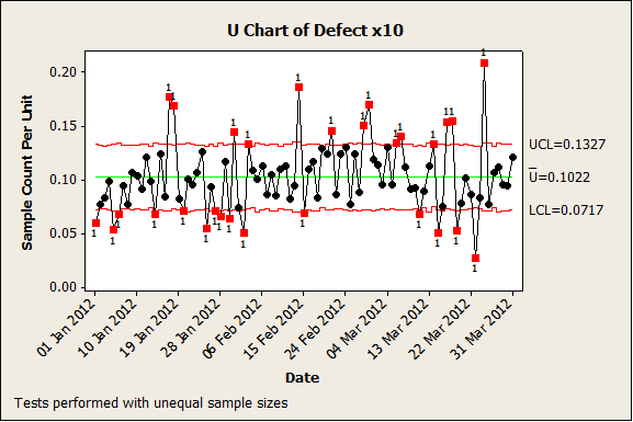
Each time Special Cause Variation is detected, it is a sign that something has changed in the process – called an assignable cause – which should be investigated. However, if there is too much Special Cause Variation, the user is quickly overwhelmed by the number of assignable causes to investigate, and they give up on the chart. An example of this might look like this:
When this happens (and it will!), remember this simple rule: Special Cause Variation is meant to be special. (The clue is in the name!) When your Control Chart displays lots and lots of Special Cause Variation, this isn’t a failure of the chart; rather, it’s a sign that one of the underlying assumptions behind the chart has been broken. These result in incorrect placement of the control limits, and thus to incorrect identification of Special Cause Variation.
The assumption of independence requires that each measurement cannot be predicted based on the value of an earlier one. When this rule is broken, data is correlated with itself, which is called autocorrelated. This is often encountered in processes where measurements are automatically taken and very many data points are collected.
Finding the real Special Causes
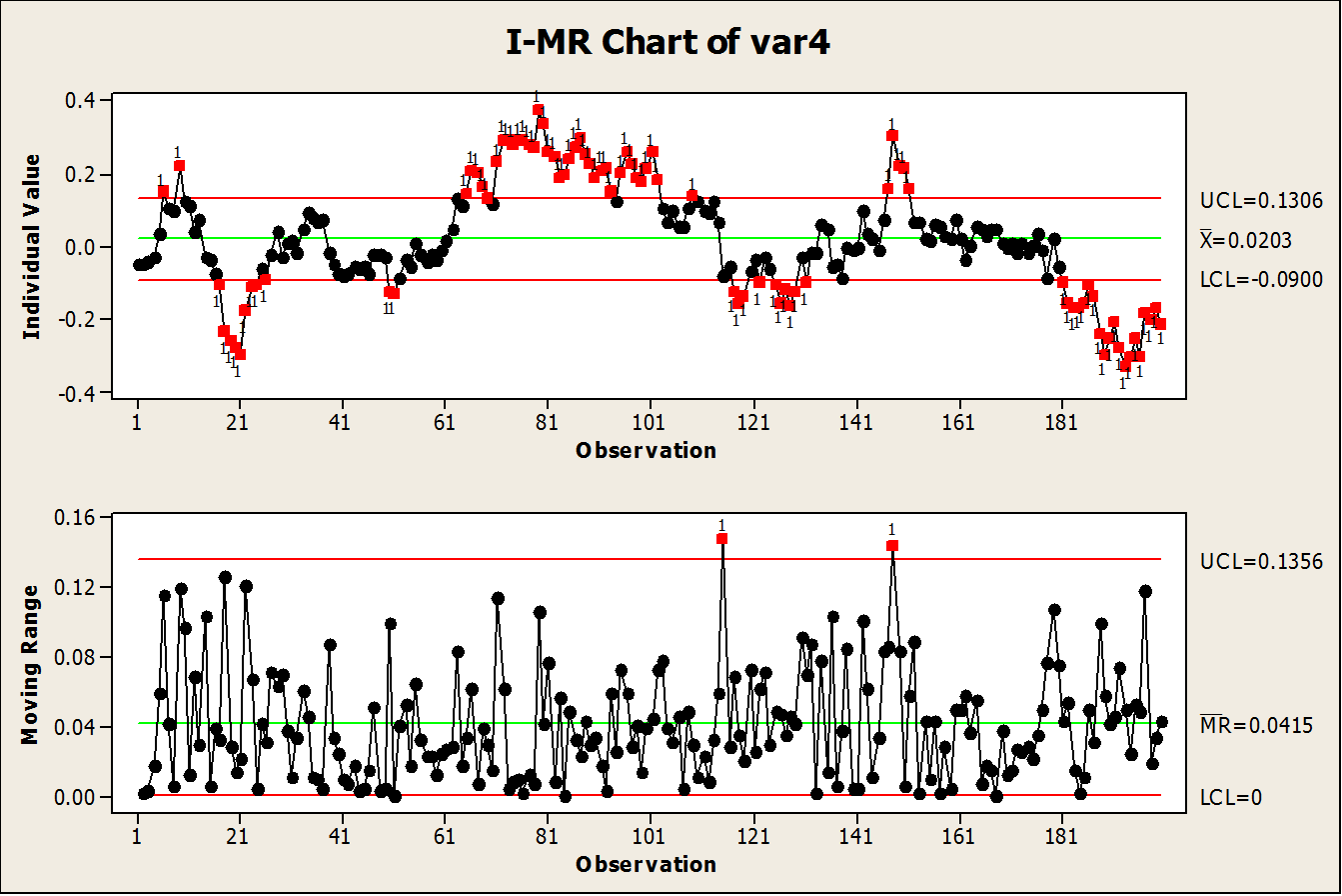
Consider what typically happens when you phone a call centre. The automated voice informs you that you are in a queue ten minutes long. If you hang up and immediately redial, the call centre is still talking to most of the same customers as before, so the queue length will be very close to the ten minutes it was before. In other words, the queuing process has a memory – each measurement is more likely to be closer to the one before than a true random distribution would predict. If we use these measurements to calculate the standard deviation of the on-hold time, it will be very small since most measurements are close to each other. One consequence of this is that the control limits calculated from this standard deviation will be very close together, resulting in charts like the one below where most of the variation appears to be Special Cause:
The solution to this problem is straightforward. Calculate how far apart measurements need to be to be independent (a routine like autocorrelation can do this), sample the data at this time interval, and use this sample to calculate the control limits which represent the true variation of the process; then plot all the data on the Control Chart using these limits. Your new limits will be wider, so only a small number of measurements (if any) will be highlighted as Special Cause, and it is now practical to investigate each of these.
A key assumption underlying attribute Control Charts (P, NP, C and U charts) is that the rate of defects or defectives is constant and low. It is very easy to break this assumption by collecting more data in each subgroup, which results in a phenomenon known as overdispersion: there is more variation in the data than would be expected from the theoretical distribution. Compare the first two Control Charts again; these display exactly the same defect rate, and the only difference is that the number of defects and the size of each subgroup has been multiplied by 10 in the second chart, yet it has much tighter control limits and much more apparent Special Cause Variation.
Big Data causes big problems
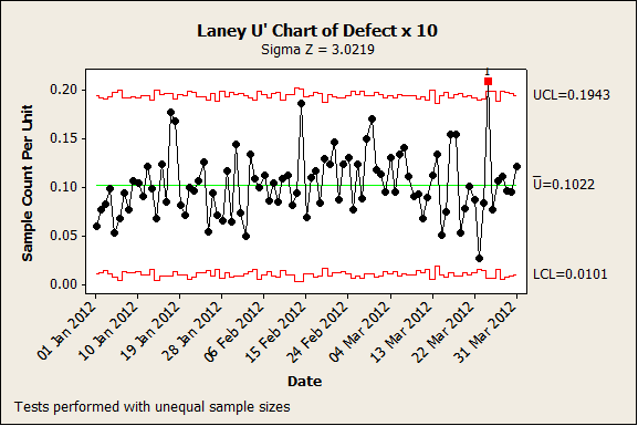
Good statistical programs include a diagnostic for overdispersion, but a good rule of thumb is that the assumptions break down when the number of defect counts in each subgroup of a C or U chart exceed 50 or when the size of the subgroup of a P or NP chart exceeds 1000. Fortunately, the solution is again straightforward: Laney P’ and U’ charts adjust the control limits to reflect the true dispersion rather than one assumed from the Binomial or Poisson distribution. The second Control Chart has been redrawn here using a Laney U’ chart:
A similar problem can occur with Xbar-S subgroup charts for continuous data. Once again, the control limits get tighter as subgroup size increases, and with very large subgroups than all the variation can appear to be Special Cause which is clearly nonsense. A good solution here is to choose smaller subgroup intervals, such as time buckets of one day rather than one month.
Ironically, all these problems are due to seemingly having too much data rather than too little. The problems are not commonly described in Lean Six Sigma courses as the original texts assumed data would usually be scarce, and the issues were only encountered in specialist areas such as continuous processes. However, the wider availability of inline process measurement has made Big Data more common in a wider range of processes and industries, and this problem is now encountered in many Lean Six Sigma projects. Luckily, the solutions described here are well-developed and straightforward to apply, so that Green and Black Belts can continue to get the value from applying Control Charts to all their processes.
If you’d like help or advice about any of the issues raised in this article, get in touch with our team of experts on 0800 066 3749.


